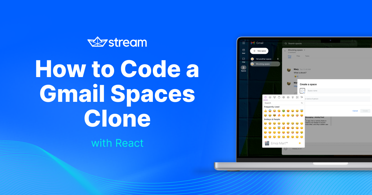
How to Code a Gmail Spaces Clone With React
April 25th, 2022
Trailer/Demo:
This is going to be quite a long tutorial post but trust me, you would love the end result of what you build. Grab your bottles of water and read/code along.
This post was originally posted on Stream's blog
The Gmail Spaces in-app messaging feature allows Gmail account users to create spaces for long-term conversations between other users.
Using Stream Chat and the React SDK from Stream, you will create a clone of this Gmail feature. We will call this stream-spaces 🚀
Application Features
There are many complex and straightforward features in Gmail spaces, some of which integrate with other Gmail services, but we cannot do that all in this clone.
The scope of this clone includes:
- Sign in using different user accounts
- Creating new spaces with add members functionality
- Navigating chat spaces with the URL
- Browsing spaces
- Pinning spaces
- Joining/Leaving spaces
Prerequisites and What You Will Learn
As a prerequisite to understanding and following this tutorial, you should have basic knowledge of React.
In this article, you will learn how to build this clone using the following concepts:
- Creating a new Stream Application
- Connecting your client React app to Stream and authenticating users
- Creating React Context for global state management
- Customizing the SDK’s components by overwriting CSS classes and using Context from the SDK
- Creating custom hooks and using built-in React hooks
Let’s Build Our Gmail Spaces Clone

Developer Setup
For this tutorial, you will install packages with NPM, so you need to have Node installed on your system. Alternatively, you can use yarn if you prefer that.
For this tutorial, I used Node v16.13.1. I encourage you to use the same version if you are coding along.
Setting Up Stream
A Stream Chat App handles all the backend messaging services (events, channels, and so on) that your client chat app needs to provide an effective messaging experience.
To create a chat app on Stream, you need a Stream account. If you do not have one, head over to the register page for a free trial account or register for a Maker Account for free indefinite access to Stream.
To create a chat app:
- Go to your Stream dashboard
- Select Create App

- Enter an App Name (stream-spaces, for this tutorial)
- Set your Server Location
- Set the Environment to Development
- Click on the Create App button
After creating your app, you will see it on your dashboard:

On your dashboard, you can manage the different channel types in your app, manage your API keys, add and remove users, add permissions, and many other admin-related operations.
You won’t be doing so much on this dashboard in this tutorial. You will instead create channels and users from the React SDK.
Your API Key is unique to your application and is required to create a chat instance on your client app. This key can be safely shared publicly.
Your application also has the Secret Key, which is also unique but required to perform admin-related API operations on your app, such as authenticating users and changing permissions, to name a few. This key should always be private, most preferably on a backend server.
For development purposes in this tutorial, we do not have a backend server, so we will primarily be using the API Key. Please take note of it as you will need it later.
Create Your Gmail Spaces Clone Application
For creating the React application for this clone, we will use create-react-app (CRA). On your terminal, run:
npx create-react-app stream-spaces
cd stream-spaces
This will create a React starter project. Next, install the dependencies we need for the project. There are two categories of dependencies.
Stream’s dependencies:
- stream-chat: the core stream chat JavaScript client library for creating a chat instance with several methods
- stream-chat-react: stream’s React SDK, built based on stream-chat, which provides UI components and context for building chat applications
Other dependencies:
- react-router-dom: for adding routes to the application. In our case, we need the start page for selecting a user, and another page for the spaces
- classnames: utility library for dynamically joining classes together
- date-fns: for interpreting dates in a readable manner
- query-string: for parsing query parameters in the URL. You will use this to set an active space based on the URL.
- styled-components: for style declarations
- react@17 and react-dom@17: CRA installs the latest versions of react and react-dom (which is version 18, released recently), but Stream’s dependencies haven’t been updated to support React v18 yet.
Install dependencies by running:
npm install stream-chat stream-chat-react react-router-dom classnames date-fns query-string styled-components react@17 react-dom@17Application Folder Structure
Before jumping to the coding part, let us look at the folder structure of this application. First, this is what comes from CRA:
├── README.md
├── package-lock.json
├── package.json
├── node_modules
├── public
| ├── favicon.ico
| ├── index.html
| ├── logo192.png
| ├── logo512.png
| ├── manifest.json
| └── robots.txt
├── src
| ├── App.css
| ├── App.js
| ├── App.test.js
| ├── index.css
| ├── index.js
| ├── logo.svg
| ├── reportWebVitals.js
| └── setupTests.js
You need to update this following this structure:
- The components will be created in src/components, so create a components directory in the src folder
- The pages (starter and spaces pages) will be created in src/views, so create a views directory in the src folder
- Assets (icons and images) will be saved in public/assets, so create an assets directory in the public folder
- Custom hooks will be created in src/hooks, so create a hooks directory
- Utilities will be created in src/utils so create a utils directory
Now, you should have the following structure:
├── README.md
├── package-lock.json
├── package.json
├── public
| ├── assets/| ├── favicon.ico
| ├── index.html
| ├── logo192.png
| ├── logo512.png
| ├── manifest.json
| └── robots.txt
├── src
| ├── App.css
| ├── App.js
| ├── App.test.js
| ├── components/| ├── hooks/| ├── index.css
| ├── index.js
| ├── logo.svg
| ├── reportWebVitals.js
| ├── setupTests.js
| ├── utils/| └── views/
Add Assets
You need two categories of assets for this tutorial–icons and images. You only need one image, which will serve as the background in the spaces page.
And you need some icons for the UI. I got these icons from the Remix Icon Library. Check out this gist for the icons. Save these svg files in public/assets/icons/.
You also need an image for the background of the spaces page. Download it from Unsplash and save it as colored-background.jpg in public/assets/images/.
Create a Starter Page for Selecting Users
The starter page shows different demo users that a user can select from to use the spaces application. In an ideal application, the user will need to authenticate with a back-end server and a database with their credentials, but we will stick with demo users for demonstration purposes.
Here is what you will build in this section:

Add Demo Users
Create a new file called src/users.js and paste the following code:
const users = [
  {
    id: "mike",
    name: "Mike",
    image:
      "https://i.picsum.photos/id/92/200/200.jpg?hmac=2cxZLFe94hVFQL5AERTDzRKET_GDG-2qpFi5-ctPekg",
  },
  {
    id: "mary1",
    name: "Mary",
    image:
      "https://i.picsum.photos/id/646/200/200.jpg?hmac=3jbia15y-hA5gmqVJjmk6BPJiisi4j-fNKPi3iXRiRo",
  },
  {
    id: "jake",
    name: "Jake",
    image:
      "https://i.picsum.photos/id/124/200/200.jpg?hmac=FuA4HgovVpaMlT_5gnjY_28jYCrrA2xrYXy3mJ9XDEw",
  },
  {
    id: "joe",
    name: "Joe",
    image:
      "https://i.picsum.photos/id/703/200/200.jpg?hmac=6zWxIBRmIf2e0jZTqvKBIwrc7wm-dPkvGky4go6Yyvg",
  },
]

export default users
This snippet above displays an array of users, each with an id, a required property for users to connect to the Stream app. name and image are optional properties, and you can add more data to the user object.
Create a Storage Utility
Next, create a storage utility in src/utils/storage.js with this code block:
export const saveToStorage = (key, value) =>
  window.localStorage.setItem(key, value)

export const getFromStorage = key => window.localStorage.getItem(key)
This will handle saving and getting data from local storage. We need this utility to save the selected user id from the start page to the storage. This way, the user will not have to select a user on every refresh.
Add Global Default Styles
We need default styles for buttons, lists, and some other elements. Replace src/index.css with the following styles:
@import url("https://fonts.googleapis.com/css2?family=Open+Sans:wght@400;500;600&family=Roboto:wght@500;700&display=swap");

body {
  margin: 0;
  font-family: "Roboto", -apple-system, BlinkMacSystemFont, "Segoe UI", "Roboto",
    "Oxygen", "Ubuntu", "Cantarell", "Fira Sans", "Droid Sans", "Helvetica Neue",
    sans-serif;
  -webkit-font-smoothing: antialiased;
  -moz-osx-font-smoothing: grayscale;
}

code {
  font-family: source-code-pro, Menlo, Monaco, Consolas, "Courier New",
    monospace;
}

* {
  box-sizing: border-box;
}

button {
  border: none;
  background: none;
  cursor: pointer;
}

button:disabled {
  cursor: not-allowed;
}

a {
  text-decoration: none;
}

ul {
  margin: 0;
  padding: 0;
  list-style: none;
}

li {
  padding: 0;
  margin: 0;
}

input {
  border: none;
}

h1,
h2,
h3,
h4,
h5,
h6,
p {
  margin: 0;
}
Using the WhatFont Chrome extension, you can identify the font used on a website. Gmail spaces uses Google Sans and Roboto. Open Sans (slightly similar to Google Sans) is public, and that’s what you have imported, together with Roboto, into the stylesheet.
Create the StartPage Component
For the starter page, create a new file src/views/StartPage.js with the following code:
import { useNavigate } from "react-router-dom"
import styled from "styled-components"

import users from "../users"
import { saveToStorage } from "../utils/storage"

const Main = styled.main`
  display: flex;
  align-items: center;
  justify-content: center;
  width: 100%;
  height: 100vh;
  flex-direction: column;
  background-color: #eee;

  h1 {
    text-align: center;
    font-size: 20px;
    margin-bottom: 20px;
  }

  .users {
    display: flex;
    align-items: center;
    justify-content: space-between;
    width: 300px;
    margin: 0 auto;

    &__user {
      display: flex;
      flex-direction: column;
      img {
        width: 50px;
        height: 50px;
        border-radius: 50%;
        margin-bottom: 5px;
      }
      .name {
        margin: 0 auto;
        text-align: center;
      }
    }
  }
`

export default function Startpage() {
  const navigate = useNavigate()

  const onClickUser = id => {
    saveToStorage("user", id)
    navigate("/spaces")
  }

  return (
    <Main>
      <h1>Select a user</h1>
      <div className="users">
        {users.map(u => (
          <button
            onClick={() => onClickUser(u.id)}
            className="users__user"
            key={u.id}
          >
            <img src={u.image} />
            <span className="name">{u.name}</span>
          </button>
        ))}
      </div>
    </Main>
  )
}
For some of the colors, I randomly selected a close color code, but for some notable colors, I used the Eye Dropper Chrome extension to pick the color from the Gmail spaces page.
In this page, you loop through the users array and display each one on the page.
When a user clicks on a user on the screen, the user’s id is saved to storage, and the browser navigates to /spaces where you will have the spaces page.
Now, you need to inform React to show this component on the index path.
Add a Route for the Start Page
Go to src/App.js and replace the content of the file to:
import { BrowserRouter as Router, Routes, Route } from "react-router-dom"
import StartPage from "./views/StartPage"

export default function App() {
  return (
    <Router>
      <Routes>
        <Route path="/" element={<StartPage />} />
      </Routes>
    </Router>
  )
}
CRA created the src/index.js file with react and react-dom v18 syntax. Because you reverted to v17, update src/index.js to:
import React from "react"
import ReactDOM from "react-dom"
import "./index.css"
import App from "./App"

ReactDOM.render(
  <React.StrictMode>
    <App />
  </React.StrictMode>,
  document.getElementById("root")
)
You can also delete the src/App.css file as you do not need it any more.
Start the development server by running npm run start on your terminal. On http://localhost:3000, you will get this page:

After selecting a user from the StartPage, the browser navigates to /spaces. This will display the SpacesPage, connect the user to Stream, and display the spaces the user belongs to.
Creating this page was easy.
Connect a User to Stream in the SpacesPage Component
To create the SpacesPage, you first need a Layout. For the Layout, you also need a Sidebar component, which holds the “Mail”, “Chat” and “Spaces” buttons and toggles the spaces list visibility.
Here’s what you will build in this section:

Create a Sidebar Component
Let us start from the Sidebar. Create a new file, src/components/Sidebar.js with this code:
import { useContext } from "react"
import { Link } from "react-router-dom"
import styled from "styled-components"

import { LayoutContext } from "./Layout"

const links = [
  { icon: "/assets/icons/mail.svg", label: "Mail", href: "#" },
  { icon: "/assets/icons/chat.svg", label: "Chat", href: "#" },
  { icon: "/assets/icons/people.svg", label: "Spaces", href: "/spaces" },
]

const Container = styled.div`
  padding: 5px;
  --borderRightColor: ${({ rightBorderVisible }) =>
    rightBorderVisible ? "rgba(146, 146, 146, 0.433)" : "transparent"};
  border-right: 1px solid var(--borderRightColor);
  height: 100%;

  .toggle-container {
    display: flex;
    justify-content: center;
    width: 100%;
    margin-bottom: 10px;

    .toggle-btn {
      width: 60px;
      height: 60px;
      border-radius: 50%;
      display: flex;
      justify-content: center;
      align-items: center;
      img {
        width: 26px;
        height: 26px;
      }

      &:hover {
        background-color: rgba(146, 146, 146, 0.233);
      }
    }
  }
  .nav-links {
    display: flex;
    flex-direction: column;

    .link {
      display: flex;
      flex-direction: column;
      align-items: center;
      color: white;
      margin-bottom: 20px;
      text-align: center;
      font-size: 12px;

      &:nth-child(3) {
        font-weight: bold;
        .img-block {
          background-color: rgba(146, 146, 146, 0.533);
        }
      }

      .img-block {
        width: 45px;
        height: 35px;
        margin-bottom: 2px;
        display: flex;
        align-items: center;
        justify-content: center;
        border-radius: 20px;

        img {
          width: 20px;
          height: 20px;
        }

        &:hover {
          background-color: rgba(146, 146, 146, 0.533);
        }
      }
    }
  }
`

export default function Sidebar() {
  const { isSpacesListOpen, setIsSpacesListOpen } = useContext(LayoutContext)

  return (
    <Container rightBorderVisible={isSpacesListOpen}>
      <div className="toggle-container">
        <button
          onClick={() => setIsSpacesListOpen(!isSpacesListOpen)}
          className="toggle-btn"
        >
          <img src="/assets/icons/hamburger.svg" alt="Toggle icon" />
        </button>
      </div>
      <div className="nav-links">
        {links.map(link => (
          <Link key={link.label} className="link" to={link.href}>
            <div className="img-block">
              <img src={link.icon} alt="" />
            </div>
            <span>{link.label}</span>
          </Link>
        ))}
      </div>
    </Container>
  )
}
In this component, you loop through the links array and display each link with their icons with the toggle side spaces button. On clicking the toggle button, the setIsSpacesListOpen function from the LayoutContext is called. This context isn’t created yet. You will create that in the Layout component.
Create a Layout Component
Create a new file src/components/Layout.js with:
import React, { createContext, useState } from "react"
import styled from "styled-components"

import Sidebar from "./Sidebar"
import { getFromStorage, saveToStorage } from "../utils/storage"

const Container = styled.div`
  display: flex;
  background-color: #333;
  height: 100vh;
  width: 100%;
  position: relative;
  background: url(/assets/images/colored-background.jpg) center no-repeat;
  &::after {
    position: absolute;
    content: "";
    left: 0;
    top: 0;
    width: 100%;
    height: 100%;
    background-color: rgba(0, 0, 0, 0.8);
    z-index: 0;
  }

  .sidebar,
  .content {
    position: relative;
    z-index: 1;
    height: 100vh;
  }

  .content {
    width: 100%;
    flex: 1;
  }
`

const spacesListStatusFromStorage = getFromStorage("is_spaces_list_open")

export const LayoutContext = createContext()

export default function Layout({ children }) {
  const [isSpacesListOpen, setIsSpacesListOpen] = useState(
    spacesListStatusFromStorage === "true" ? true : false
  )

  const setSpacesStatus = status => {
    const statusToBoolean = status || status === "true" ? true : false
    saveToStorage("is_spaces_list_open", statusToBoolean)
    setIsSpacesListOpen(statusToBoolean)
  }

  return (
    <LayoutContext.Provider
      value={{
        isSpacesListOpen,
        setIsSpacesListOpen: setSpacesStatus,
      }}
    >
      <Container>
        <div className="sidebar">
          <Sidebar />
        </div>
        <div className="content">{children}</div>
      </Container>
    </LayoutContext.Provider>
  )
}
In this code, you set the background of the Layout to be an image from the asset folder. Also, the local storage keeps track of the spaces list status, be it open or not.
Also, you create a LayoutContext and pass the isSpacesListOpen state and setIsSpacesListOpen method to the children components. The Sidebar, a child of this component, uses these context data to update the spaces list status accordingly with the toggle button.
Create a SpacesPage Component
For the spaces page, create a new file src/views/SpacesPage.js with the following code:
import React, { useEffect, useState } from "react"
import { StreamChat } from "stream-chat"
import { useNavigate } from "react-router-dom"
import { Chat, LoadingIndicator } from "stream-chat-react"

import Layout from "../components/Layout"
import { getFromStorage } from "../utils/storage"
import users from "../users"

import "stream-chat-react/dist/css/index.css"

const API_KEY = "f5wu7bvh4xg5"

export default function SpacesPage() {
  const [chatClient, setChatClient] = useState(null)
  const navigate = useNavigate()

  const userId = getFromStorage("user")

  const user = users.find(({ id }) => id === userId)

  useEffect(() => {
    if (!user) return navigate("/")

    const client = StreamChat.getInstance(API_KEY)

    client.connectUser(user, client.devToken(user.id))

    setChatClient(client)

    return () => {
      client?.disconnectUser()
    } // cleanup user connection on unmount
  }, [])

  return (
    <Layout>
      {!chatClient ? <LoadingIndicator /> : <Chat client={chatClient}></Chat>}
    </Layout>
  )
}
The notable parts of this code are:
-
import '.../index.css'to import Stream’s classes for the UI components -
You get the saved
userIdfrom the local storage and find the user from the users array -
On mount, using useEffect, you:
- Navigate to the homepage if the userId is not found in the users array
- Create a chat instance, using the API Key of your app on your dashboard
- Connect the user to the Stream app by passing the user object and a token
- Return a cleanup function, which disconnects the user from the Stream app when the component unmounts
- If the
chatClientis null, you return aLoadingIndicatorfrom the React SDK, else, you return the Chat component and pass thechatClientto theclientprop
Note: the connectUser method creates a WebSocket connection which connects a user to a Stream application. This connection aids emitting and reponding to different events that occur in the application. Learn more in the Initialization and Users documentation. Also, here is a best practicie for connecting and disconnecting a user.
Stream uses tokens for user authentication to verify that a user has authorized access to your Stream app. Ideally, this token should be generated using your secret key, and this should happen on your backend server as you wouldn’t want to expose the secret key. For development purposes, we will use development tokens generated with the devToken method which takes a user id argument as seen in the code:
...client.devToken(user.id)For development tokens to work, your app must be in development mode and you must disable authentications on your Stream dashboard.
Head over to your dashboard, select the stream-spaces app and scroll down to the Authentication Section:

Select Disable Auth Checks and click on Save. With this, you can now use development tokens.
Add a Route for the Spaces Page
Back to src/App.js, you need to add a route for the spaces page. First, import the SpacesPage component:
import SpacesPage from "./views/SpacesPage"Below the first route for the start page, add:
<Route path="/spaces" element={<SpacesPage />} />Back on your browser on http://localhost:3000, select a user, and you will be navigated to the spaces page, showing this:

In your dashboard, select Explorer and users to see the users in your app:

Currently, there are two users: mike and dillion-megida-stream. The former is the user I clicked on in the Start page, and the latter is the admin user that is created for my app when I created an account on Stream. In your case, you will find your organization name.
To add more users, go to the Start page and click every demo user.
Now, your users dashboard should have all users added:

Create the Spaces Layout Component
The Layout component you created in the previous component serves as the main layout for the app. Now, you need to create a spaces layout which will show the header (showing the search input and user icon), the spaces list and the conversations in a space.
Here’s what you will build in this section:

Let us start with the header.
Creating a Header Component
Create a new file src/components/spaces/Header.js with the following:
import { useChatContext } from "stream-chat-react"
import styled from "styled-components"

const StyledHeader = styled.header`
  padding: 15px 0 10px;
  display: flex;

  .left-column {
    width: var(--leftColumnWidth);

    .gmail-logo {
      margin-left: 20px;
      img {
        height: 40px;
      }
    }
  }

  .right-column {
    flex: 1;
    display: flex;
    align-items: center;

    .search-input {
      position: relative;
      height: 50px;
      width: 600px;
      color: blue;

      img {
        position: absolute;
        left: 20px;
        bottom: 0;
        top: 0;
        margin: auto 0;
      }

      input {
        background-color: rgba(255, 255, 255, 0.1);
        height: 100%;
        width: 100%;
        border-radius: 10px;
        padding-left: 50px;
        outline: none;
        font-size: 16px;

        &::placeholder {
          color: white;
        }
      }
    }

    .other-options {
      padding-right: 20px;
      margin-left: auto;
      display: flex;
      align-items: center;
      .option-btn {
        margin-right: 10px;
        img {
          width: 20px;
          height: 20px;
        }
      }

      .user-icon {
        img {
          object-fit: cover;
          border-radius: 50%;
          width: 30px;
          height: 30px;
        }
      }
    }
  }
`

export default function Header() {
  const { client } = useChatContext()

  return (
    <StyledHeader>
      <div className="left-column">
        <div className="gmail-logo">
          <img
            src="https://ssl.gstatic.com/ui/v1/icons/mail/rfr/logo_gmail_lockup_dark_2x_r4.png"
            alt="Gmail logo"
          />
        </div>
      </div>

      <div className="right-column">
        <div className="search-input">
          <img src="/assets/icons/search.svg" alt="" />
          <input placeholder="Search spaces" />
        </div>

        <div className="other-options">
          {[
            { img: "/assets/icons/question.svg", alt: "Help icon" },
            { img: "/assets/icons/settings.svg", alt: "Settings icon" },
            { img: "/assets/icons/tiny-grid.svg", alt: "Google apps icon" },
          ].map(option => (
            <button className="option-btn" key={option.alt}>
              <img src={option.img} alt={option.alt} />
            </button>
          ))}
          <button className="user-icon">
            <img src={client.user.image} alt="Profile icon" />
          </button>
        </div>
      </div>
    </StyledHeader>
  )
}
Using useChatContext, exposed by the React SDK, you get the client object, which has a user object that contains information about the user. With this, you can display the user’s image on the profile icon.
Next, you will create the SpacesList component. This component contains a list of spaces, each with a context menu (with the pin and leave actions). Let us start by creating the context menu component.
The context menu and modals (which you will create later) look like a Dialog element. So, you will create a reusable Dialog component that can be shared between these components.
Create a Dialog Component
Create a new file src/components/Dialog.js with the following:
import styled from "styled-components"

const Container = styled.div`
  background-color: white;
  box-shadow: 0 1px 2px 0 rgba(60, 64, 67, 0.3), 0 2px 6px 2px rgba(60, 64, 67, 0.15);
  border-radius: 5px;
`

export default function Dialog({ className, children }) {
  return <Container className={className}>{children}</Container>
}
Create a SpaceContextMenu Component
Create a new file src/components/spaces/SpaceContextMenu.js with the following:
import styled from "styled-components"

import Dialog from "../Dialog"

const Container = styled(Dialog)`
  width: 100%;
  padding: 10px;
  background-color: white;
  border-radius: 5px;
  padding: 10px 0;

  .menu-btn {
    display: flex;
    align-items: center;
    width: 100%;
    text-align: left;
    padding: 7px 10px;

    &:hover {
      background-color: #ccc;
    }

    &__icon {
      width: 20px;
      margin-right: 20px;

      &--pin--unpin {
        position: relative;
        &::after {
          content: "";
          width: 2px;
          height: 20px;
          background-color: #5f6367;
          transform: rotate(45deg);
          position: absolute;
          right: 0;
          left: 0;
          margin: auto;
          bottom: 0;
          top: 0;
        }
      }

      img {
        width: 20px;
        height: 20px;
      }
    }

    &__details {
      .main-text {
        display: block;
        margin-bottom: 2px;
      }

      .sub-text {
        color: #666;
        font-size: 13px;
      }
    }
  }
`

export default function SpaceContextMenu({ space, onClickOption }) {
  const onLeave = async () => {}

  const onPin = async () => {
    onClickOption()
  }

  const onUnpin = async () => {
    onClickOption()
  }

  const menu = [
    {
      label: "Pin",
      icon: "/assets/icons/pin.svg",
      id: "pin",
    },
    {
      label: "Leave",
      icon: "/assets/icons/arrow-down.svg",
      subLabel: "You can always return",
      id: "leave",
    },
  ]

  const menuClicks = {
    leave: onLeave,
    pin: onPin,
  }

  return (
    <Container>
      {menu.map(m => (
        <button
          onClick={() => menuClicks[m.id]()}
          className="menu-btn"
          key={m.id}
        >
          <div className="menu-btn__icon">
            <img src={m.icon} alt="" />
          </div>
          <div className="menu-btn__details">
            <span className="main-text">{m.label}</span>
            {m.subLabel && <span className="sub-text">{m.subLabel}</span>}
          </div>
        </button>
      ))}
    </Container>
  )
}
In this component, you loop through the menu items (“Pin” and “Leave”), and you create handlers for these functions when clicked. For now, these functions do not do anything, but you will update them later.
For the UI of each of these items in the space list, you will create a SpaceItem component. But before that, we will create a custom hook–useClickOutside. The purpose of this hook is to handle click events outside dialogs. For example, when a click-outside happens on the context menu, we want them off the screen.
Create a useClickOutside Custom Hook
Create a new file src/hooks/useClickOutside.js with the following:
import { useEffect } from "react"

export default function useClickOutside({ ref, cb }, dependencies) {
  useEffect(() => {
    const onClickOutside = e => {
      if (!ref || !ref.current) return

      if (!ref.current.contains(e.target)) cb()
    }

    window.addEventListener("click", onClickOutside)

    return () => window.removeEventListener("click", onClickOutside)
  }, [...dependencies])
}
This hook receives an object argument and a dependencies argument. The object has two properties:
- The element reference
- A callback function, which is called when a click-outside event occurs
Creating a SpaceItem Component
Create a new file src/components/spaces/SpaceItem.js with the following:
import { useRef, useState } from "react"
import { useNavigate } from "react-router-dom"
import styled from "styled-components"

import useClickOutside from "../../hooks/useClickOutside"
import SpaceContextMenu from "./SpaceContextMenu"

const Container = styled.div`
  width: 100%;
  position: relative;
  border-radius: 30px;

  &.active {
    background-color: rgba(255, 255, 255, 0.3);
  }

  &:not(&.active):hover {
    background-color: rgba(255, 255, 255, 0.1);
  }

  .popup {
    position: absolute;
    max-width: 200px;
    width: 100%;
    left: calc(var(--leftColumnWidth) - 28px);
    top: 4px;
  }

  .preview-btn {
    width: 100%;
    display: flex;
    align-items: center;
    cursor: pointer;
    padding-right: 40px;

    .emoji {
      padding: 12px;
      width: 20px;
      height: 20px;
      border-radius: 50%;
      background-color: #ccc;
      display: flex;
      align-items: center;
      justify-content: center;
      margin-right: 8px;
    }

    .name {
      padding: 10px;
      font-size: 15px;
      color: white;
      flex: 1;
      text-align: left;
    }
  }

  &:hover {
    .more-btn {
      .more-icon {
        display: block;
      }
      .pin-icon {
        display: none;
      }
    }
  }

  .more-btn {
    position: absolute;
    right: 0;
    top: 2px;
    border-radius: 50%;
    align-items: center;
    justify-content: center;
    padding: 10px;
    display: flex;

    .more-icon {
      display: none;
    }

    .pin-icon {
      display: none;
      &--show {
        display: block;
      }
    }

    &:hover {
      background-color: rgba(255, 255, 255, 0.35);
    }

    img {
      width: 16px;
      height: 16px;
    }
  }
`

export default function SpaceItem({
  channel,
  displayTitle,
  active,
  setActiveChannel,
  watchers,
}) {
  const navigate = useNavigate()
  const menuRef = useRef(null)

  const [isMenuOpen, setIsMenuOpen] = useState(false)

  const onClickSpace = () => {
    navigate("?space_id=" + channel.id)
    setActiveChannel(channel, watchers)
  }

  const onClickSpaceMenu = () => {
    setIsMenuOpen(isMenuOpen => !isMenuOpen)
  }

  useClickOutside(
    { ref: menuRef, cb: () => isMenuOpen && setIsMenuOpen(false) },
    [isMenuOpen]
  )

  return (
    <Container className={active ? "active" : ""}>
      {isMenuOpen && (
        <div ref={menuRef} className="popup">
          <SpaceContextMenu
            onClickOption={() => setIsMenuOpen(false)}
            space={channel}
          />
        </div>
      )}
      <button onClick={onClickSpace} className="preview-btn">
        <div className="emoji">
          {channel.data.emoji || channel.data.name.charAt(0)}
        </div>
        <span className="name">{displayTitle}</span>
      </button>
      <button onClick={onClickSpaceMenu} className="more-btn">
        <img
          className="pin-icon"
          src="/assets/icons/pin-white.svg"
          alt="Pin indicator"
        />
        <img
          className="more-icon"
          src="/assets/icons/more.svg"
          alt="More button"
        />
      </button>
    </Container>
  )
}
This component receives five props:
channeldisplayTitle(could be thenameoridof the channel ifnamedoesn’t exist)active(boolean, which indicates whether this channel is currently active or not)setActiveChannel(function for setting the active channel by clicking on the channel)- watchers (for querying watchers of a channel)
Conversations in Stream are stored in channels. Also, there are different channel types.
In this space item component, the useClickOutside hook is used for hiding the context menu on a click-outside event.
When a space is clicked, the URL is updated with the spaces id, and the setActiveChannel function is used to set the active channel (that is, the active space).
Now, to the SpacesListcomponent.
Create a SpacesList Component
Create a new file src/components/spaces/SpacesList.js with the following:
import { useContext, useEffect, useRef, useState } from "react"
import { useLocation } from "react-router-dom"
import { ChannelList, useChatContext } from "stream-chat-react"
import styled from "styled-components"
import queryString from "query-string"

import SpaceItem from "../spaces/SpaceItem"
import Dialog from "../Dialog"
import useClickOutside from "../../hooks/useClickOutside"
import { SpacesContext } from "./SpacesLayout"

const Container = styled.div`
  width: var(--leftColumnWidth);
  padding: 0 15px;
  height: 100%;
  display: flex;
  flex-direction: column;
  position: relative;

  .new-space-container {
    position: relative;

    .new-btn {
      max-width: 200px;
      border-radius: 30px;
      background-color: white;
      display: flex;
      align-items: center;
      padding: 10px 20px;
      margin: 0 0 20px;

      img {
        width: 30px;
        height: 30px;
        margin-right: 10px;
      }
    }

    .new-space-dialog {
      padding: 10px 0;
      padding-right: 5px;
      position: absolute;
      right: -100px;
      top: 0;
      z-index: 5;

      .menu-btn {
        padding: 10px 20px;
        width: 100%;
        display: flex;
        align-items: center;
        border-top-right-radius: 30px;
        border-bottom-right-radius: 30px;

        &:hover {
          background-color: #eee;
        }

        .icon {
          margin-right: 30px;

          img {
            width: 20px;
            height: 20px;
          }
        }
      }
    }
  }

  .spaces-empty {
    display: flex;
    justify-content: center;
    align-items: center;
    flex-direction: column;
    height: 100%;

    img {
      width: 40px;
      height: 40px;
      margin-bottom: 20px;
    }

    .no-spaces-text {
      color: #80868a;
      text-align: center;
      display: block;
      margin-bottom: 4px;
      font-size: 12px;
    }

    .create-space-btn {
      color: #7895dd;
      text-align: center;
      font-size: 12px;
    }
  }

  .spaces-list {
    .str-chat {
      width: 100%;
      height: 100%;

      &.messaging {
        background-color: transparent;
      }
    }

    .str-chat__channel-list-messenger {
      background: transparent;
      width: 100%;
      min-width: 100%;
    }

    .str-chat-channel-list .str-chat__channel-list-messenger__main {
      padding: 0;
      overflow: visible;
    }

    .str-chat__loading-channels {
      width: var(--leftColumnWidth);
      height: 100%;
      background: transparent;
    }
  }
`

export default function SpacesList() {
  const { channelListKey, spaces, setActiveSpace } = useContext(SpacesContext)
  const { client } = useChatContext()

  const location = useLocation()

  const newSpaceDialogRef = useRef(null)
  const [showNewSpaceDialog, setShowNewSpaceDialog] = useState(false)

  useClickOutside(
    {
      ref: newSpaceDialogRef,
      cb: () => showNewSpaceDialog && setShowNewSpaceDialog(false),
    },
    [showNewSpaceDialog]
  )

  const { space_id } = queryString.parse(location.search)

  useEffect(() => {
    if (!spaces) return

    async function init() {
      if (space_id) {
        const spaceById = spaces.find(s => s.id === space_id)
        if (spaceById) return setActiveSpace(spaceById)
      }

      setActiveSpace(spaces[0], false)
    }

    init()
  }, [space_id, spaces])

  const noSpaces = spaces?.length < 1

  return (
    <Container>
      <div className="new-space-container">
        <button onClick={() => setShowNewSpaceDialog(true)} className="new-btn">
          <img src="/assets/icons/add.svg" alt="" />
          New space
        </button>
        {showNewSpaceDialog && (
          <div ref={newSpaceDialogRef}>
            <Dialog className="new-space-dialog">
              {[
                {
                  icon: "/assets/icons/people.svg",
                  label: "Create space",
                  id: "create",
                },
                {
                  icon: "/assets/icons/grid.svg",
                  label: "Browse spaces",
                  id: "browse",
                },
              ].map(menu => {
                const actions = {
                  create: () => null,
                  browse: () => null,
                }

                return (
                  <button
                    onClick={() => {
                      setShowNewSpaceDialog(false)
                      actions[menu.id]()
                    }}
                    className="menu-btn"
                    key={menu.id}
                  >
                    <div className="icon">
                      <img src={menu.icon} alt="" />
                    </div>
                    <span className="label">{menu.label}</span>
                  </button>
                )
              })}
            </Dialog>
          </div>
        )}
      </div>

      {noSpaces ? (
        <div className="spaces-empty">
          <img src="/assets/icons/grid.svg" alt="" />
          <span className="no-spaces-text">No spaces yet</span>
          <button className="create-space-btn">Create or find a space</button>
        </div>
      ) : (
        <div className="spaces-list">
          <ChannelList
            key={channelListKey}
            Preview={SpaceItem}
            filters={{
              customType: "space",
              members: { $in: [client.user.id] },
            }}
          />
        </div>
      )}
    </Container>
  )
}
Notable things from this component:
- It also uses the Dialog component to display the two options for creating a space (Browsing spaces and Creating spaces)
- It uses the ChannelList component from the React SDK, applies a filter for the spaces that the currently logged-in user is a member of, and also uses a custom component, SpaceItem, as the Preview of each item in the list
- If there’s a
space_idquery from the URL, it gets the first space from the list of spaces and sets it as the active space. If there is nospace_id, it sets the first space in the list as the active one. - The channel list component also uses the
channelListKeyfrom theSpacesContext, which you will create shortly.
When the channel list key changes, the channel list rerenders. We need this functionality for cases where users join a new channel, or a channel is pinned.
Create a SpacesEmpty Component
When there are no spaces in the app, we want to show a Spaces Empty component. This will be the content of SpaceContent which you will create shortly.
Create a new file src/components/spaces/SpacesEmpty.js with:
import styled from "styled-components"

const Container = styled.div`
  display: flex;
  justify-content: center;
  flex-direction: column;
  align-items: center;
  height: 100%;

  .img-block {
    width: 300px;
    height: 250px;

    img {
      object-fit: cover;
      width: 100%;
      height: 100%;
    }
  }

  h3 {
    font-family: "Open Sans";
    font-size: 22px;
    font-weight: 600;
    line-height: 40px;
    color: #202124;
    margin: 0 0 10px;
  }

  p {
    margin: 0;
    font-size: 14px;
    color: #5f6368;
  }

  .create-space-btn {
    background-color: #1b72e8;
    color: white;
    margin-top: 30px;
    width: 130px;
    height: 35px;
    border-radius: 3px;
  }

  .browse-spaces-btn {
    margin-top: 25px;
    color: #1b72e8;
  }
`

export default function SpacesEmpty() {
  return (
    <Container>
      <div className="img-block">
        <img
          src="http://ssl.gstatic.com/ui/v1/icons/mail/rfr/zero_state_rooms_2x.png"
          alt=""
        />
      </div>
      <h3>Do more together in spaces</h3>
      <p>
        Tackle group projects, chat with your team, or share your interests 🍰
      </p>
      <button className="create-space-btn">Create a space</button>
      <button className="browse-spaces-btn">Browse spaces</button>
    </Container>
  )
}
Create the SpaceContent Component
The function of this component is to show the header, message list, message input and reactions in a selected space (active channel according to Stream). For now, we will not add all the elements for this component.
Create a new file src/components/spaces/SpaceContent.js with:
import { useContext } from "react"
import { Channel } from "stream-chat-react"
import styled from "styled-components"

import SpacesEmpty from "./SpacesEmpty"
import { SpacesContext } from "./SpacesLayout"

const Container = styled.div`
  background-color: white;
  width: 100%;
  height: 100%;
  position: relative;
  border-radius: 10px;
  overflow: hidden;
`

export default function SpaceContent() {
  const { spaces } = useContext(SpacesContext)

  if (!spaces) return <></>

  if (spaces.length < 1)
    return (
      <Container>
        <SpacesEmpty />
      </Container>
    )

  return (
    <Channel>
      <Container></Container>
    </Channel>
  )
}
Since there are no spaces yet in the app, the SpacesEmpty component will be visible in the container.
Create a SpacesLayout Component
With the different spaces section created, you can create a spaces layout component. Create a new file src/components/spaces/SpacesLayout.js with:
import { createContext, useContext, useEffect, useState } from "react"
import { useChatContext } from "stream-chat-react"
import styled from "styled-components"
import { useNavigate } from "react-router-dom"
import classNames from "classnames"

import Header from "./Header"
import SpaceContent from "./SpaceContent"
import SpacesList from "./SpacesList"
import { LayoutContext } from "../Layout"

const Container = styled.div`
  height: 100vh;
  display: flex;
  flex-direction: column;
  padding-bottom: 20px;
  --leftColumnWidth: 270px;

  .body {
    flex: 1;
    display: flex;
    width: 100%;

    .left-column {
      position: relative;
      z-index: 1;
      transition: visibility 300ms, opacity 300ms, transform 300ms, width 300ms;

      &--hidden {
        opacity: 0;
        transform: translateX(-301px);
        width: 0;
        visibility: hidden;
      }

      &--show {
        opacity: 1;
        visibility: visible;
        transform: translateX(0);
        width: var(--leftColumnWidth);
        transition: transform 300ms, width 300ms;
      }
    }

    .right-column {
      flex: 1;
      width: 100%;
      padding-right: 20px;

      .str-chat,
      .str-chat__container {
        border-radius: 10px;
        height: 100%;
      }

      .str-chat-channel {
        height: 100%;
      }

      .str-chat.messaging {
        background-color: white;
      }

      .str-chat__date-separator {
        display: none;
      }
    }
  }
`

export const SpacesContext = createContext()

export default function SpacesLayout() {
  const navigate = useNavigate()
  const { client, setActiveChannel, channel } = useChatContext()
  const [spaces, setSpaces] = useState(null)
  const [users, setUsers] = useState(null)

  const setActiveSpace = (space, shouldNavigate = true) => {
    setActiveChannel(space)
    shouldNavigate && navigate("?space_id=" + space.id)
  }

  const { isSpacesListOpen } = useContext(LayoutContext)

  const [channelListKey, setChannelListKey] = useState(Math.random())

  const updateChannelListKey = () => setChannelListKey(Math.random())

  useEffect(() => {
    if (!client) return

    const initChannels = async () => {
      const spaces = await client.queryChannels({
        customType: "space",
        members: { $in: [client.user.id] },
      })
      setSpaces(spaces)
    }

    const initUsers = async () => {
      const response = await client.queryUsers({})
      setUsers(
        response.users.filter(({ id }) => id !== "dillion-megida-stream")
      )
    }

    initChannels()
    initUsers()
  }, [client])

  return (
    <SpacesContext.Provider
      value={{
        updateChannelListKey,
        channelListKey,
        spaces,
        activeSpace: channel,
        setActiveSpace,
        users,
      }}
    >
      <Container>
        <div>
          <Header />
        </div>
        <div className="body">
          <div
            className={classNames(
              "left-column",
              isSpacesListOpen ? "left-column--show" : "left-column--hidden"
            )}
          >
            <SpacesList />
          </div>

          <div className="right-column">
            <SpaceContent></SpaceContent>
          </div>
        </div>
      </Container>
    </SpacesContext.Provider>
  )
}
In this component, you create the SpacesContext. This context provides:
- The
channelListKeywhich the ChannelList in the spaces list component uses - The
updateChanelListKeywhich you will use in other parts of the application to rerender the channel list to show the updated values - The
spacesthat the user is a member of - The
usersin the app, but without the admin dillion-megida-stream - The
activeSpace(selected space) - The
setActiveSpaceto select a space at a time and also update the URL query
With the spaces layout created, you can add it to src/views/SpacesPage.js as a child of the Chat component like this:
import SpacesLayout from "../components/spaces/SpacesLayout"

// ...
return (
  <Layout>
    {!chatClient ? (
      <LoadingIndicator />
    ) : (
      <Chat client={chatClient}>
        <SpacesLayout />      </Chat>
    )}
  </Layout>
)
On your browser, you should have this:

Currently, there are no spaces, so you cannot see the SpaceItem and SpaceContextMenu yet.
On clicking the toggle in the sidebar, you should have:

On clicking New space, you should have this:

On clicking Create space or Browse spaces, nothing happens. Let us start by adding the functionality to create spaces.
Building the CreateSpaceModal Component
This is what you will build in this section:

The first thing you need to do is keep track of a “creating space” state to show (active state) and hide (inactive state) the AddSpace modal accordingly.
Keeping Track of the CreatingSpace Global State
The reason why you want to keep track of global state for creating spaces is because different parts of the application can trigger a “create space” event and you want to avoid prop drilling.
Going back to the SpacesContext, you will add more data. Go to src/components/SpacesLayout.js and add the following state:
// ...
const [isCreatingSpace, setIsCreatingSpace] = useState(false)
// ...
Then add these to the SpacesContext provider:
return (
  <SpacesContext.Provider
    value={{
      updateChannelListKey,
      channelListKey,
      spaces,
      activeSpace: channel,
      setActiveSpace,
      users,
      isCreatingSpace,      setIsCreatingSpace,    }}
  >
    // ...
  </SpacesContext.Provider>
)
Create a String Utility
You need a string utility that replaces the spaces in a string with hyphens and also converts the whole string to lowercase. You need this to create ids from a space name.
Create a new file src/utils/string.js with:
export const removeSpaces = str =>
  str
    .replace(/\s+/g, "-")
    .trim()
    .toLowerCase()
Create CreateSpaceModal Component
This component is a modal, with all the functionality you need to create a new space. We will go through the code for this component section by section.
Create a new file src/components/spaces/CreateSpaceModal.js.
First, add the imports:
import classNames from "classnames"
import { Picker } from "emoji-mart"
import { useContext, useRef, useState } from "react"
import { useChatContext } from "stream-chat-react"
import styled from "styled-components"

import useClickOutside from "../../hooks/useClickOutside"
import { removeSpaces } from "../../utils/string"
import Dialog from "../Dialog"
import { LayoutContext } from "../Layout"
import { SpacesContext } from "./SpacesLayout"
You will use Picker for creating an emoji selector for the new space. Also, you will use useClickOutside to handle clicking outside the modal. You will also use the setCreatingSpace method from the SpacesContext.
Next, the styles using styled-components:
const Container = styled.div`
  position: absolute;
  width: 100%;
  height: 100vh;
  background-color: rgba(0, 0, 0, 0.4);
  display: flex;
  justify-content: center;
  align-items: center;

  .modal-container {
    width: 100%;
    max-width: 600px;
  }
`

const Modal = styled.div`
  background-color: white;
  padding: 30px 0;

  form {
    padding: 0 20px;

    h2 {
      font-weight: 400;
      font-size: 20px;
      margin-bottom: 20px;
    }

    .space-name {
      display: flex;
      align-items: center;
      margin-bottom: 25px;

      &__input-group {
        flex: 1;

        input {
          background-color: #f8f9fa;
          height: 40px;
          width: 100%;
          padding: 8px 8px;
          border-bottom: 1px solid #e5e5e6;
          &::placeholder {
            color: #8e9295;
          }
        }
      }

      .emoji-container {
        width: 40px;
        height: 40px;
        margin-right: 15px;
        position: relative;
      }

      .emoji-btn {
        width: 40px;
        height: 40px;
        font-size: 25px;
        display: flex;
        justify-content: center;
        align-items: center;
        background-color: #f8f9fa;
        border-radius: 3px;
        position: relative;

        img {
          width: 25px;
          height: 25px;
        }

        &::after {
          content: "+";
          position: absolute;
          color: #1b72e8;
          bottom: 0;
          right: 0;
          width: 18px;
          height: 18px;
          font-size: 18px;
          border-radius: 3px;
          background-color: white;
        }
      }
    }

    .add-users-container {
      position: relative;
      .input-group {
        background-color: #f8f9fa;
        width: 100%;
        border-bottom: 1px solid #e5e5e6;
        display: flex;
        align-items: center;
        padding: 0 10px;

        .added-user {
          border: 1px solid #ccc;
          border-radius: 30px;
          display: flex;
          align-items: center;
          height: 30px;
          margin-right: 10px;

          &__img {
            height: 25px;
            width: 25px;
            margin-left: 2px;
            border-radius: 50%;
            margin-right: 7px;
          }

          &__name {
            color: #333;
            margin-right: 10px;
          }

          &__remove-btn {
            color: #333;
            font-size: 15px;
            margin-right: 5px;
          }
        }

        input {
          height: 40px;
          padding: 8px 8px;
          background: none;
          width: 100%;
          outline: none;
          &::placeholder {
            color: #8e9295;
          }
        }
      }

      .users-popup {
        position: absolute;
        z-index: 6;
        padding: 15px 20px 10px 0;
        left: 0;
        width: 100%;
        border-top: 1px solid #1b72e8;
        border-top-left-radius: 0px;
        border-top-right-radius: 0px;

        &__user {
          display: flex;
          align-items: center;
          padding: 10px 0 10px 30px;
          border-top-right-radius: 30px;
          border-bottom-right-radius: 30px;
          width: 100%;

          &:hover {
            background-color: #eee;
          }

          &__image {
            width: 40px;
            height: 40px;
            border-radius: 50%;
            overflow: hidden;
            margin-right: 10px;

            img {
              width: 100%;
              height: 100%;
            }
          }

          &__details {
            display: flex;
            .online-indicator {
              margin-right: 5px;
              width: 8px;
              height: 8px;
              border: 1px solid #333;
              border-radius: 50%;

              &--online {
                background-color: green;
              }
            }
          }

          &__name {
            font-weight: bold;
            position: relative;
            top: -3px;
          }
        }
      }
    }

    .emoji-picker {
      position: absolute;
      right: 0;
      top: 50px;
      z-index: 2;
    }

    .actions {
      margin-top: 30px;
      border-top: 1px solid #e5e5e6;
      padding: 30px 20px 0;
      width: calc(100% + 40px);
      position: relative;
      left: -20px;
      display: flex;
      justify-content: flex-end;

      button {
        width: 80px;
        height: 30px;
        border-radius: 3px;
      }

      &__cancel {
        color: #1b72e8;
      }

      &__submit {
        background-color: #1b72e8;
        color: white;

        &:disabled {
          background-color: #f0f3f4;
          color: #c4c8cb;
          cursor: not-allowed;
        }
      }
    }
  }
`
Now, to the component itself:
export default function CreateSpaceModal() {
  const modalRef = useRef(null)
  const emojiPickerRef = useRef(null)
  const addUserInputRef = useRef(null)
  const peoplePopupRef = useRef(null)

  const [emojiPickerOpened, setEmojiPickerOpened] = useState(false)
  const [peoplePopupOpened, setPeoplePopupOpened] = useState(false)

  const [selectedEmoji, setSelectedEmoji] = useState(null)
  const [name, setName] = useState("")
  const [usersSearch, setUsersSearch] = useState("")
  const [addedUsers, setAddedUsers] = useState([])

  const { isSpacesListOpen, setIsSpacesListOpen } = useContext(LayoutContext)

  const { users, setActiveSpace, setIsCreatingSpace } = useContext(
    SpacesContext
  )

  const { client } = useChatContext()
}
You need refs for the modal (for outside-click events), the emoji picker (for click-outside events), the add user input (to control focus for the people popup), and for the people popup (click-outside events).
Also, you created default states for some components.
From the SpacesContext, you extracted setIsCreatingSpace and from LayoutContext, you extracted isSpacesListOpen and setIsSpacesListOpen. You specifically need the setIsSpacesListOpen such that on creating a new space, if the spaces list is closed, it will open.
Let us continue. Add:
const onSelectEmoji = emojiObject => {
  setSelectedEmoji(emojiObject)
  setEmojiPickerOpened(false)
}

useClickOutside(
  {
    ref: modalRef,
    cb: () => !emojiPickerOpened && setIsCreatingSpace(false),
  },
  [emojiPickerOpened]
)

useClickOutside(
  {
    ref: emojiPickerRef,
    cb: () => emojiPickerOpened && setEmojiPickerOpened(false),
  },
  [emojiPickerOpened]
)

useClickOutside(
  {
    ref: peoplePopupRef,
    cb: () => {
      if (
        !peoplePopupOpened ||
        addUserInputRef.current === document.activeElement
      ) {
        return
      }

      addUserInputRef.current.blur()
      setPeoplePopupOpened(false)
    },
  },
  [peoplePopupOpened]
)
For this code:
- the
onSelectEmojiupdates the emoji state and also closes the emoji popup - click outsides for the emoji picker, modal, and for the people popup
const otherUsers = users?.filter(({ id }) => id !== client.user.id)

const filteredUsers = otherUsers?.filter(({ name, id }) => {
  const doesSearchMatch = name
    .toLowerCase()
    .startsWith(usersSearch.toLowerCase())

  if (!doesSearchMatch) return false

  const isUserAdded = addedUsers.find(user => id === user.id)

  if (isUserAdded) return false

  return true
})

const addUser = (e, u) => {
  e.stopPropagation()
  setAddedUsers(addedUsers => [...addedUsers, u])
  addUserInputRef.current.focus()
  setUsersSearch("")
}

const removeAddedUser = (e, user) => {
  e.stopPropagation()
  const newUsersState = addedUsers.filter(({ id }) => id !== user.id)
  setAddedUsers(newUsersState)
  addUserInputRef.current.focus()
}
For this code:
otherUsersare the users in the app, but with the currently logged-in user filtered outfilteredUsersare the users that match the search criteria and are not already added in theaddedUsersarray- The
addUsermethod adds a user to theaddedUsersarray - The
removeAddedUserremoves a user from theaddedUsersarray
const onSubmit = async e => {
  e.preventDefault()

  const data = {
    emoji: selectedEmoji?.native || null,
    name,
  }

  const channel = client.channel(
    "messaging",
    "space-" + removeSpaces(data.name),
    {
      name: data.name,
      emoji: data.emoji,
      members: [client.user.id, ...addedUsers.map(({ id }) => id)],
      customType: "space",
    }
  )

  await channel.watch()

  setActiveSpace(channel)

  setIsCreatingSpace(false)

  if (!isSpacesListOpen) setIsSpacesListOpen(true)
}
This code snippet includes the submit handler for the form which creates a new space. The notable part of this code is creating a channel.
Using the client from the useChatContext exposed by the React SDK, you declare a channel. The channel method on the client accepts three arguments:
- the channel type, which in our case is “messaging”
- the channel id which is gotten from the name
- an object with information about the space such as:
- the space name
- the space emoji
- the members of the space, which is the logged in user and the added users
- a
customTypeof space which you use to filter the channels in this app
After declaring the channel, you watch the channel. Watching the channel creates the channel if it does not exist already, and also watches the channel for events (such as new messages, new members, etc.)
After watching, you set the created channel to be active, set the creating space status to false, and also open the spaces list if it is closed.
And for the UI:
return (
  <Container>
    <div className="modal-container" ref={modalRef}>
      <Modal>
        <form onSubmit={onSubmit}>
          <h2>Create a space</h2>
          <div className="space-name">
            <div className="emoji-container">
              <button
                onClick={() => !emojiPickerOpened && setEmojiPickerOpened(true)}
                className="emoji-btn"
                type="button"
              >
                {selectedEmoji ? (
                  selectedEmoji.native
                ) : (
                  <img
                    src="/assets/icons/smiling-emoji.svg"
                    alt="Placeholder emoji"
                  />
                )}
              </button>

              {emojiPickerOpened && (
                <div ref={emojiPickerRef} className="emoji-picker">
                  <Picker onSelect={onSelectEmoji} />
                </div>
              )}
            </div>

            <div className="space-name__input-group">
              <input
                name="name"
                onChange={e => setName(e.target.value)}
                placeholder="Space name"
              />
            </div>
          </div>

          <div className="add-users-container">
            <div className="input-group">
              {addedUsers.length > 0 &&
                addedUsers.map(u => (
                  <div className="added-user" key={u.id}>
                    <img className="added-user__img" src={u.image} alt="" />
                    <span className="added-user__name">{u.name}</span>
                    <button
                      onClick={e => removeAddedUser(e, u)}
                      type="button"
                      className="added-user__remove-btn"
                    >
                      X
                    </button>
                  </div>
                ))}
              <input
                onFocus={() => setPeoplePopupOpened(true)}
                ref={addUserInputRef}
                onChange={({ target }) => setUsersSearch(target.value)}
                value={usersSearch}
                placeholder={
                  addedUsers.length < 1 ? "Enter name of person" : ""
                }
              />
            </div>
            {peoplePopupOpened && filteredUsers && filteredUsers.length > 0 && (
              <div ref={peoplePopupRef}>
                <Dialog className="users-popup">
                  <ul>
                    {filteredUsers.map(u => (
                      <li key={u.id}>
                        <button
                          onClick={e => addUser(e, u)}
                          className="users-popup__user"
                        >
                          <div className="users-popup__user__image">
                            <img src={u.image} alt="" />
                          </div>
                          <div className="users-popup__user__details">
                            <div
                              className={classNames(
                                "online-indicator",
                                u.online && "online-indicator--online"
                              )}
                            ></div>
                            <span className="users-popup__user__name">
                              {u.name}
                            </span>
                          </div>
                        </button>
                      </li>
                    ))}
                  </ul>
                </Dialog>
              </div>
            )}
          </div>

          <div className="actions">
            <button
              onClick={() => setIsCreatingSpace(false)}
              className="actions__cancel"
              type="button"
            >
              Cancel
            </button>
            <button
              disabled={!name.length}
              className="actions__submit"
              type="submit"
            >
              Create
            </button>
          </div>
        </form>
      </Modal>
    </div>
  </Container>
)
In the UI, you add the refs to the correct elements and use the states to display the popups, emoji picker, or modal.
Display the CreateSpaceModal On the UI
To add this modal to the UI, go to the spaces layout component in src/components/spaces/SpacesLayout.js and add the modal towards the end of the Container component like this:
import CreateSpaceModal from "./CreateSpaceModal"
//  ...
return (
  <Container>
    // ...
    {isCreatingSpace && <CreateSpaceModal />}  </Container>
)
But the isCreatingSpace state is still false. There are currently two elements that can trigger a creating space scenario:
- The Create space menu in the SpacesList component:

- and the Create a space button in the SpacesEmpty component:

Let us start from the spaces list.
In src/components/spaces/SpacesList.js, get the setIsCreatingSpace method from the spaces context:
//  ...
export default function SpacesList() {
  //  ...
  const {
    channelListKey,
    spaces,
    setActiveSpace,
    setIsCreatingSpace,  } = useContext(SpacesContext)
  //  ...
}
And for the new space dialog, update the creating space status like this:
//  ...
const actions = {
  create: () => setIsCreatingSpace(true),  browse: () => null,
}
//  ...
When you click on New Space, the menu dialog appears with Create space and Browse spaces. When you click on Create space, the isCreatingSpace state becomes true and the CreateSpaceModal appears like this:

Also, go to src/components/spaces/SpacesEmpty.js and trigger the create space modal to open like this:
import { useContext } from "react"
import { SpacesContext } from "./SpacesLayout"

export default function SpacesEmpty() {
  const { setIsCreatingSpace } = useContext(SpacesContext)  //  ...
}
Then, call the method on the create button:
//  ...
<button
  onClick={
    () => setIsCreatingSpace(true)  }
  className="create-space-btn"
>
  Create a space
</button>
//  ...
Now, you can create your first space. Select an emoji, enter the name of the Space and add two members:

Congrats! Your very first space now shows in the in the SpacesList component:

And here is the context menu you created earlier:

Use this modal to create more spaces with names “Second space”, “Third space”, “Fourth space”, and “Fifth space” with any emojis of your choice and any members of your choice.

With the space creation feature added and spaces now showing in the list, we can add more actions.
Leaving Spaces
When you create a new space, it creates a new channel in your Stream app. Now, you will add the leaving space functionality. Leaving a space does not delete the space from your Stream app. It only removes you as a member which you can rejoin later.
The leave button lives in the SpaceContextMenu, so head over to src/components/spaces/SpaceContextMenu.js to add that functionality.
First, start with the imports:
import { useContext } from "react"
import { useNavigate } from "react-router-dom"
import { useChatContext } from "stream-chat-react"
import { SpacesContext } from "./SpacesLayout"
Then, update the onLeave function:
export default function SpaceContextMenu({ space, onClickOption }) {
  const { client } = useChatContext()

  const { setActiveSpace, activeSpace, spaces } = useContext(SpacesContext)

  const navigate = useNavigate()

  const onLeave = async () => {    space.removeMembers([client.user.id])    if (activeSpace.cid === space.cid) {      const spacesForThisUser = spaces.filter(s => s.cid !== space.cid)      setActiveSpace(spacesForThisUser[0])      navigate("?space_id=" + spacesForThisUser[0].id)    }  }  //  ...
}
This function:
- Removes the currently logged-in user as a member of the space using the
removeMembersmethod on the space object - Sets the active space if the space left was active
With this, go back to the UI, open the context menu of any space and click on Leave. You should see the spaces list updated to the spaces the currently logged-in user belongs to.
What if a user wants to rejoin a space or basically join other spaces in the Stream app that they do not belong to? That’s where we add the Browse Spaces feature.
Create the Browse Spaces Modal
This component will show the spaces that the currently logged-in user does not belong to and also provide the option for them to join the space.
This is what you will build in this section:

Add Permissions for Users to Browse Channels
Stream works with permissions for different types of users. Users can be admins, channel owners, channel members, or ordinary users.
By default, ordinary users cannot browse the channels in your Stream application. They can only see the channels that they belong to. To give these users permission to browse channels, you need to update the Permissions settings for your app.
To update your app’s permissions settings:
- Go to the stream-spaces app on your dashboard
- Select the messaging channel type (because your app is of this type)
- Scroll down to the Permissions section and add ReadChannel and ReadChannelMembers permissions to the
Users can create channelsrole:

These permissions allow users to access the information of channels they do not belong to.
Keep Track of the Browsing Spaces Global State
For the same reason you created a space global state, you want to keep track of the browsing spaces state without prop drilling.
Go to src/components/SpacesLayout.js and add the following state:
//  ...
const [isBrowsingSpaces, setIsBrowsingSpaces] = useState(false)
//  ...
Then add these to the SpacesContext provider:
//  ...
return (
  <SpacesContext.Provider
    value={{
      updateChannelListKey,
      channelListKey,
      spaces,
      activeSpace: channel,
      setActiveSpace,
      users,
      isCreatingSpace,
      setIsCreatingSpace,
      isBrowsingSpaces,      setIsBrowsingSpaces,    }}
  >
    // ...
  </SpacesContext.Provider>
)
//  ...
Create the Browsing Spaces Modal
Create a new file src/components/spaces/BrowseSpacesModal.js.
Start with the imports:
import classNames from "classnames"
import { useContext, useEffect, useRef, useState } from "react"
import { useChatContext } from "stream-chat-react"
import styled from "styled-components"

import useClickOutside from "../../hooks/useClickOutside"
import Dialog from "../Dialog"
import { SpacesContext } from "./SpacesLayout"

const Container = styled.div`
  position: absolute;
  width: 100%;
  height: 100vh;
  background-color: rgba(0, 0, 0, 0.4);
  display: flex;
  justify-content: center;
  align-items: center;
  z-index: 5;

  .modal-container {
    width: 100%;
    max-width: 500px;
  }
`

const Modal = styled(Dialog)`
  width: 100%;
  background-color: white;

  .header {
    display: flex;
    align-items: center;
    padding: 20px 20px;
    box-shadow: 0 2px 2px 0 rgb(0 0 0 / 14%), 0 1px 5px 0 rgb(0 0 0 / 12%),
      0 3px 1px -2px rgb(0 0 0 / 20%);

    h2 {
      font-weight: 400;
      flex: 1;
    }

    .nav {
      width: 80px;
      display: flex;
      justify-content: space-between;
    }
  }

  .body {
    padding: 40px 20px;

    &__content {
      width: 100%;
      min-height: 350px;
      input {
        background-color: #f8f9fa;
        height: 40px;
        width: 100%;
        padding: 10px 8px;
        border-bottom: 1px solid #e5e5e6;
        &::placeholder {
          color: #8e9295;
          width: 100%;
        }
      }

      &__space-list {
        border: 1px solid #eaeaea;
        border-radius: 5px;
        margin-top: 40px;

        &--empty {
          display: none;
        }

        &__item {
          position: relative;
          display: flex;
          padding: 15px 30px;
          justify-content: space-between;

          &:hover {
            background-color: #eee;
          }

          .details {
            text-align: left;
            flex: 1;
            .name {
              display: block;
              font-size: 15px;
              margin-bottom: 6px;
            }
            .members-count {
              font-size: 13px;
              color: #5f6367;
            }
          }

          &:not(:last-child) {
            border-bottom: 1px solid #e5e5e6;
          }

          .add-btn {
          }
        }
      }

      .empty-list {
        margin-top: 40px;
        border: 1px solid #eaeaea;
        height: 240px;
        width: 100%;
        display: flex;
        flex-direction: column;
        align-items: center;
        text-align: center;

        &--empty {
          display: none;
        }

        img {
          width: 100px;
        }

        p {
          margin: 15px 0 25px;
        }

        button {
          background-color: #1b72e8;
          color: white;
          border-radius: 3px;
          padding: 10px 20px;
        }
      }
    }
  }
`
Then:
export default function BrowseSpacesModal() {
  const { client } = useChatContext()

  const {
    updateChannelListKey,
    setActiveSpace,
    isBrowsingSpaces,
    setIsBrowsingSpaces,
    setIsCreatingSpace,
  } = useContext(SpacesContext)

  const [spaces, setSpaces] = useState([])
  const [filteredSpaces, setFilteredSpaces] = useState([])

  const modalRef = useRef(null)

  const [inputValue, setInputValue] = useState("")

  useClickOutside(
    {
      ref: modalRef,
      cb: () => setIsBrowsingSpaces(false),
    },
    [isBrowsingSpaces]
  )

  useEffect(() => {
    const getSpaces = async () => {
      const spaces = await client.queryChannels({
        customType: "space",
        members: { $nin: [client.user.id] },
      })

      setSpaces(spaces)
      setFilteredSpaces(spaces)
    }

    getSpaces()
  }, [])

  useEffect(() => {
    const filteredSpaces = spaces.filter(s =>
      s.data.name.toLowerCase().startsWith(inputValue.toLowerCase())
    )

    setFilteredSpaces(filteredSpaces)
  }, [inputValue])
}
Here’s what’s happening in this code snippet:
- You keep track of the
filteredSpacesstate based on the input - You use the
modalRefanduseClickOutsidehook for click-outside events outside the modal - You use the
useEffecthook, which updates thefilteredSpacesstate when the input state changes
For the UI:
//  ...
return (
  <Container>
    <div ref={modalRef} className="modal-container">
      <Modal>
        <div className="header">
          <h2>Browse Spaces</h2>
          <div className="nav">
            {[
              {
                icon: "/assets/icons/more-dark.svg",
                alt: "Menu",
                id: "menu",
              },
              { icon: "/assets/icons/close.svg", alt: "Close", id: "close" },
            ].map(m => {
              const actions = {
                close: () => setIsBrowsingSpaces(false),
              }

              return (
                <button onClick={() => actions[m.id]()} key={m.id}>
                  <img src={m.icon} alt={m.alt} />
                </button>
              )
            })}
          </div>
        </div>

        <div className="body">
          <div className="body__content">
            <input
              onChange={e => setInputValue(e.target.value)}
              placeholder="Space name"
            />

            <ul
              className={classNames(
                "body__content__space-list",
                filteredSpaces.length < 1 && "body__content__space-list--empty"
              )}
            >
              {filteredSpaces.map(s => {
                const membersCount = Object.keys(s.state.members).length

                const joinSpace = async () => {
                  await s.addMembers([client.user.id])
                  await s.watch()

                  setActiveSpace(s)

                  setIsBrowsingSpaces(false)
                  updateChannelListKey(true)
                }

                return (
                  <li className="body__content__space-list__item" key={s.id}>
                    <div className="details">
                      <span className="name">{s.data.name}</span>
                      <span className="members-count">
                        {membersCount} members
                      </span>
                    </div>
                    <button onClick={joinSpace} className="add-btn">
                      <img src="/assets/icons/add-blue.svg" alt="Join space" />
                    </button>
                  </li>
                )
              })}
            </ul>

            <div
              className={classNames(
                "empty-list",
                filteredSpaces.length > 0 && "empty-list--empty"
              )}
            >
              <img
                src="https://www.gstatic.com/dynamite/images/room_doesnot_exist_2x.png"
                alt=""
              />
              <p>Can't find a matching space or you've already joined it</p>
              <button
                onClick={() => {
                  setIsBrowsingSpaces(false)
                  setIsCreatingSpace(true)
                }}
              >
                Create space
              </button>
            </div>
          </div>
        </div>
      </Modal>
    </div>
  </Container>
)
//  ...
For getting the members of a space, you use the state object on a channel (which in our case is space). The state object has a members object with many properties where the key of a property is the user id and the value is an object of the user’s information.
Using Object.keys(s.state.members).length gives us the number of object keys.
For joining a space, you have a joinSpace function. This function:
- Adds members to the space using the addMembers** method of the space (which is **client.user.id** which is the currently logged in user)
- Watches** a channel for events
- Sets the
isBrowsingSpacesstate tofalse - Updates the channel list key so that the spaces list updates with the new channel
Display the BrowseSpaceModal on the UI
To add this modal to the UI, go to the spaces layout component in src/components/spaces/SpacesLayout.js and add the modal after the CreateSpaceModal:
import BrowseSpacesModal from "./BrowseSpacesModal"

//  ...
return (
  <Container>
    // ...
    {isCreatingSpace && <CreateSpaceModal />}
    {isBrowsingSpaces && <BrowseSpacesModal />}  </Container>
)
//  ...
But, the isBrowsingSpaces is false. Similar to the create space modal, there are two components that can update the browsing spaces state: the SpacesList and the SpacesEmpty component.
For the spaces list, go to src/components/spaces/SpacesList.js. Get the setIsBrowsingSpaces from the SpacesContext like:
const {
  channelListKey,
  spaces,
  setActiveSpace,
  setIsCreatingSpace,
  setIsBrowsingSpaces,} = useContext(SpacesContext)
//  ...
For the actions object, update the browsing spaces state:
const actions = {
  create: () => setIsCreatingSpace(true),
  browse: () => setIsBrowsingSpaces(true),}
In SpacesEmpty, also update the browsing spaces state:
const { setIsCreatingSpace, setIsBrowsingSpaces } = useContext(SpacesContext)

return (
  //  ...
  <button
    onClick={() => setIsBrowsingSpaces(true)}    className="browse-spaces-btn"
  >
    Browse spaces
  </button>
  //  ...
)
Now, when you click on Browse spaces, you get this:

On joining a channel with the plus button, you will get this:

Create a SpaceContent Component
This component will display the content of the active space which is the:
- header, with the name of the of the space and the number of members
- list of messages with their reactions
- message input for sending a new message (with a reaction selector)
Here is what you will build in this section:

Let us start from the header.
Create a SpaceHeader Component
Create a new file src/components/spaces/SpaceHeader.js. First, add the imports and styles.
import { useContext } from "react"
import styled from "styled-components"
import { SpacesContext } from "./SpacesLayout"

const Container = styled.div`
  position: relative;

  .top,
  .bottom {
    padding-left: 40px;
  }

  .top {
    display: flex;
    align-items: center;

    .arrow-left {
      position: absolute;
      left: 10px;
      img {
        width: 16px;
        height: 16px;
      }
    }

    .details {
      color: #333;
      text-align: left;
      padding: 8px;

      &:hover {
        background-color: rgba(146, 146, 146, 0.233);
        border-radius: 5px;
      }

      &__name {
        display: flex;
        align-items: center;

        &-text {
          font-size: 16px;
        }

        .menu-btn {
          margin-left: 7px;
        }
      }

      &__members {
        display: block;
        margin-top: 3px;
        font-size: 12px;
        color: #818487;
      }
    }
  }

  .menu {
    margin-top: 3px;
    border-bottom: 1px solid rgba(146, 146, 146, 0.233);

    &__btn {
      font-size: 13px;
      color: #818487;

      &:not(:last-child) {
        margin-right: 30px;
      }

      &--active {
        color: #1b72e8;
        position: relative;
        padding-bottom: 8px;

        &::after {
          content: "";
          width: 25px;
          height: 3px;
          position: absolute;
          bottom: 0;
          left: 0;
          right: 0;
          margin: 0 auto;
          border-top-left-radius: 3px;
          border-top-right-radius: 3px;
          background-color: #1b72e8;
        }
      }
    }
  }
`
Next, the component:
const menus = [
  {
    id: "chat",
    label: "Chat",
  },
  {
    id: "files",
    label: "Files",
  },
  {
    id: "tasks",
    label: "Tasks",
  },
]

export default function SpaceHeader() {
  const { activeSpace } = useContext(SpacesContext)

  return (
    <Container>
      <div className="top">
        <button className="arrow-left">
          <img src="/assets/icons/arrow-left.svg" alt="Go back button" />
        </button>
        <button className="details">
          <div className="details__name">
            <span className="details__name-text">
              {activeSpace?.data?.name}
            </span>
            <img
              className="menu-btn"
              src="/assets/icons/caret-down.svg"
              alt="Space menu button"
            />
          </div>
          <span className="details__members">
            {activeSpace?.data?.member_count} members
          </span>
        </button>
      </div>

      <div className="bottom menu">
        {menus.map(menu => (
          <button
            className={
              "menu__btn " + (menu.id === "chat" ? "menu__btn--active" : "")
            }
            key={menu.id}
          >
            {menu.label}
          </button>
        ))}
      </div>
    </Container>
  )
}
The menus array is used for showing the top bar menu options. For this app, you will only use the chat menu.
In the SpaceHeader, you use the activeSpace’s information for the header.
Create a SpaceMessageItem Component
Stream’s MessageList component renders a scrollable list of messages with improved performance. You do not need to create a custom message list, but you can customize the UI of each message item in the list to look like Gmail’s.
Create a new file src/components/spaces/SpaceMessageItem.js. Start with the imports and styles:
import classNames from "classnames"
import { format, isToday } from "date-fns"
import { useRef, useState } from "react"
import {
  Attachment,
  ReactionSelector,
  SimpleReactionsList,
  useMessageContext,
} from "stream-chat-react"
import styled from "styled-components"

import useClickOutside from "../../hooks/useClickOutside"

const MessageBlock = styled.div`
  display: flex;
  margin-bottom: 7px;

  .avatar {
    border-radius: 50%;
    overflow: hidden;
    margin-right: 20px;
    width: 30px;
    height: 0;

    img {
      display: none;
      object-fit: cover;
      width: 100%;
      height: 100%;
    }
  }

  .message {
    width: 100%;
    &__header {
      display: none;
      padding-left: 5px;
      margin-bottom: 5px;
      align-items: flex-end;
    }

    &__sender {
      font-weight: bold;
      margin-right: 10px;
    }

    &__date {
      color: #acafb1;
      font-size: 14px;
      line-height: 17px;
    }

    &__inner {
      position: relative;
      padding: 4px 6px;
    }

    &__text {
      font-size: 15px;

      &--link {
        color: #1c71e8;
      }
    }

    .str-chat__message-attachment--image {
      max-width: 300px;
    }

    &__options {
      position: absolute;
      display: none;
      background-color: white;
      border-radius: 20px;
      box-shadow: 1px 1px 3px #acafb1;
      right: 20px;
      top: -25px;
      align-items: center;

      &--open {
        display: flex;
      }

      &__btn {
        width: 30px;
        height: 30px;
        border-radius: 50%;
        display: flex;
        align-items: center;
        justify-content: center;

        &:not(:last-child) {
          margin-right: 5px;
        }

        img {
          width: 20px;
          height: 20px;
        }

        &--emoji--active {
          background-color: #e7eaed;
        }
      }
    }

    &__inner:hover {
      background-color: #f6f6f6;
      .message__options {
        display: flex;
      }
    }

    &__reaction-selector {
      position: absolute;
      right: 280px;
      top: -90px;
      z-index: 20;
    }
  }
`
You will use the:
useClickOutsidecustom hook to handle clicking outside the reaction selector- Stream’s ReactionSelector and SimpleReactionsList for selecting and displaying reactions on each message
- Stream’s Attachment for attachments in a message (for this tutorial, we will only use link attachments)
- Stream’s useMessageContext to get the active message
And for the component:
export default function CustomMessage() {
  const { message } = useMessageContext()

  const reactionSelectorRef = useRef(null)
  const [showReactionSelector, setShowReactionSelector] = useState(false)
  useClickOutside(
    {
      ref: reactionSelectorRef,
      cb: () => showReactionSelector && setShowReactionSelector(false),
    },
    [showReactionSelector]
  )

  let messageDateFormatted = ""

  const messageDate = new Date(message?.created_at)
  const isTodayMessage = isToday(messageDate)

  if (isTodayMessage) {
    messageDateFormatted = format(messageDate, "p")
  } else {
    messageDateFormatted = format(messageDate, "ccc p")
  }

  return (
    <MessageBlock>
      <div className="avatar">
        <img src={message?.user?.image} alt="" />
      </div>

      <div className="message">
        <div className="message__header">
          <div className="message__sender">{message?.user?.name}</div>
          <div className="message__date">{messageDateFormatted}</div>
        </div>

        <div className="message__inner">
          <p
            className="message__text"
            dangerouslySetInnerHTML={{
              __html: message.text.replace(
                /https?:\/\/.*[^\s]/gi,
                url => `<a class='message__text--link' href=${url}>${url}</a>`
              ),
            }}
          />
          <Attachment attachments={message.attachments} />
          <SimpleReactionsList />

          {showReactionSelector && (
            <div
              ref={reactionSelectorRef}
              className="message__reaction-selector"
            >
              <ReactionSelector />
            </div>
          )}
          <div
            className={classNames("message__options", {
              "message__options--open": showReactionSelector,
            })}
          >
            {[
              {
                icon: "/assets/icons/smiling-emoji.svg",
                alt: "Choose emoji",
                id: "emoji",
                onClick: () => setShowReactionSelector(true),
              },
              {
                icon: "/assets/icons/pencil.svg",
                alt: "Edit message",
                id: "edit",
              },
              {
                icon: "/assets/icons/delete.svg",
                alt: "Delete message",
                id: "delete",
              },
            ].map(opt => (
              <button
                onClick={opt.onClick}
                className={classNames("message__options__btn", {
                  [`message__options__btn--${opt.id}--active`]: showReactionSelector,
                })}
                key={opt.id}
              >
                <img src={opt.icon} alt={opt.alt} />
              </button>
            ))}
          </div>
        </div>
      </div>
    </MessageBlock>
  )
}
Using the active message, you display the text, the attachments, a reaction selector and a reaction list. The emoji button on the message’s context menu is used to show the reaction selector.
Create a SpaceMessageInput Component
Create a new file src/components/spaces/SpaceMessageInput.js with the following imports and styles:
import { Picker } from "emoji-mart"
import { useRef, useState } from "react"
import { useChannelActionContext } from "stream-chat-react"
import styled from "styled-components"

import useClickOutside from "../../hooks/useClickOutside"

const Container = styled.div`
  position: absolute;
  width: 100%;
  left: 0;
  bottom: 0;
  height: 100px;
  padding: 0 20px;
  background-color: white;
  display: flex;
  align-items: center;

  .input-block {
    display: flex;
    position: relative;
    bottom: 0;
    align-items: center;
    width: 100%;
  }

  .add-btn {
    width: 22px;
    height: 22px;
    display: flex;
    justify-content: center;
    align-items: center;
    color: #707377;
    border: 2px solid #707377;
    font-size: 13px;
    font-weight: bold;
    border-radius: 50%;
    padding-bottom: 2px;
  }

  form {
    display: flex;
    align-items: center;
    margin-left: 20px;
    flex: 1;
    width: 100%;

    .text-input-group {
      position: relative;
      height: 50px;
      width: 100%;

      .text-input {
        height: 100%;
        border: 1px solid #dbdde1;
        width: 100%;
        border-radius: 50px;
        padding: 0 20px;
      }

      .input-options {
        position: absolute;
        right: 0;
        top: 0;
        bottom: 0;
        margin: auto 0;
        padding: 0 10px;
        display: flex;
        align-items: center;

        .emoji-input {
          width: 34px;
          height: 34px;
          position: relative;

          &--open::before {
            content: "";
            width: 38px;
            height: 38px;
            background-color: #e5eefc;
            border-radius: 50%;
            position: absolute;
            left: -3px;
            top: -3px;
          }

          .default-emoji {
            width: 100%;
            height: 100%;
            position: relative;
            z-index: 1;
          }

          .emoji-picker {
            position: absolute;
            right: 0;
            bottom: 40px;
          }
        }
      }
    }

    .submit-btn {
      margin-left: 10px;
      &:disabled {
        opacity: 0.5;
      }
    }
  }
`
For the imports:
- The
Pickercomponent is used for selecting emojis - The useChannelActionContext provides actions you can perform on a channel (specifically, you will use the
sendMessagemethod) - The
useClickOutsidewill be used for handling click-outside events of thePickercomponent
Add the following to the file:
export default function SpaceInput() {
  const emojiPickerRef = useRef(null)
  const { sendMessage } = useChannelActionContext()

  const [text, setText] = useState("")

  const [isEmojiOpen, setIsEmojiOpen] = useState(false)

  const onClickEmoji = emojiObj => {
    console.log({ emojiObj })
    setText(text + emojiObj.native)
  }

  useClickOutside(
    {
      ref: emojiPickerRef,
      cb: () => isEmojiOpen && setIsEmojiOpen(false),
    },
    [isEmojiOpen]
  )

  const onSubmit = async e => {
    e.preventDefault()

    await sendMessage({ text })
    setText("")
  }
}
You use the sendMessage method from the channel action context to send messages to the channel.
And the UI:
//  ...
return (
  <Container>
    <div className="input-block">
      <button className="add-btn">+</button>
      <form onSubmit={onSubmit}>
        <div className="text-input-group">
          <input
            onChange={e => setText(e.target.value)}
            placeholder="History is on"
            className="text-input"
            value={text}
          />
          <div className="input-options">
            <button
              type="button"
              onClick={() => setIsEmojiOpen(true)}
              className={
                "emoji-input" + (isEmojiOpen ? " emoji-input--open" : "")
              }
            >
              <img
                className="default-emoji"
                src="/assets/icons/smiling-emoji.svg"
                alt="Emoji icon"
              />
              {isEmojiOpen && (
                <div ref={emojiPickerRef} className="emoji-picker">
                  <Picker onSelect={onClickEmoji} />
                </div>
              )}
            </button>
          </div>
        </div>
        <button className="submit-btn" disabled={text.length < 1} type="submit">
          <img src="/assets/icons/send.svg" alt="Send message" />
        </button>
      </form>
    </div>
  </Container>
)
//  ...
Display the Content of a Space
With all the components for the active space added, you want to show them in the SpaceContent component.
Go to src/components/spaces/SpaceContent.js. First, add more imports:
import { Channel, MessageList } from "stream-chat-react"
import { formatDistance } from "date-fns"

import SpaceHeader from "./SpaceHeader"
import SpaceMessageItem from "./SpaceMessageItem"
import SpaceMessageInput from "./SpaceMessageInput"
Next, update the container style with:
const Container = styled.div`
  background-color: white;
  width: 100%;
  height: 100%;
  position: relative;
  border-radius: 10px;
  overflow: hidden;

  .chat-body {
    height: calc(100vh - 180px);
    background-color: white;
    overflow-y: auto;
    border-radius: 10px;
    &__details {
      height: 300px;
      display: flex;
      flex-direction: column;
      align-items: center;
      .chat-icon {
        width: 150px;
        margin-bottom: 10px;
      }

      .date {
        font-size: 12px;
        color: #b0b3b4;
        text-align: center;
      }

      .action-btns {
        margin-top: 20px;
        display: flex;
        justify-content: center;

        button {
          border: 1px solid #f4f5f6;
          border-radius: 3px;
          display: flex;
          align-items: center;
          color: #5494ee;
          padding: 10px 8px;

          &:not(:last-child) {
            margin-right: 10px;
          }

          img {
            margin-right: 7px;
          }
        }
      }

      .history-details {
        margin-top: 20px;

        &__heading {
          display: flex;
          justify-content: center;
          color: #7f8082;
          font-size: 12px;
          text-transform: uppercase;

          img {
            margin-right: 10px;
          }
        }

        p {
          text-align: center;
          font-size: 12px;
          color: #a6a8ab;
          margin-top: 3px;
        }
      }
    }

    .str-chat__list {
      padding-bottom: 100px;
      height: calc(100%);
    }

    .str-chat__li {
      &--top,
      &--single {
        .avatar {
          height: 30px;
        }
        img {
          display: block;
        }

        .message__header {
          display: flex;
        }
      }

      .str-chat__simple-reactions-list {
        border: 1px solid #d9dce0;
        border-radius: 20px;
        display: inline-flex;
        align-items: center;

        .emoji-mart-emoji span {
          width: 16px !important;
          height: 16px !important;
        }

        &-item--last-number {
          color: #1b72e8;
          font-weight: bold;
          font-size: 16px;
          margin-bottom: 2px;
        }
      }

      .str-chat__message-simple {
        &--me {
          justify-content: flex-start;
        }

        .str-chat__reaction-list--reverse {
          left: 15px;
          right: initial;
        }

        .str-chat__reaction-list--reverse::before {
          left: -26px;
          width: 26px;
          background-position: 0 0;
        }

        .str-chat__reaction-list--reverse::after {
          right: -13px;
          width: 13px;
          background-position: -46px 0;
        }

        .str-chat__reaction-list--reverse ul {
          margin: -1px -4px 0 -16px;
        }

        .str-chat__message-simple-status {
          display: none;
        }

        .str-chat__avatar {
          order: 1;
          margin-left: 0;
          margin-right: 15px;
          position: relative;
        }

        .str-chat__message-inner {
          order: 2;
          margin-left: 0;
        }

        .str-chat__message-text-inner {
          background: transparent;
          padding: 0;
          min-height: unset;
        }

        .str-chat__message-data {
          left: 0;
        }
      }

      &--bottom {
        margin-bottom: 30px;
      }
    }
  }
`
Get the activeSpace from the SpacesContext:
//  ...
const { spaces, activeSpace } = useContext(SpacesContext)
//  ...
And for the UI when the length of the spaces is more than zero:
// ...
return (
<Channel>
<Container>
<SpaceHeader />
<div className="chat-body">
<div className="chat-body__details">
<img
className="chat-icon"
src="https://www.gstatic.com/dynamite/images/new_chat_room_1x.png"
alt=""
/>
<p className="date">
You created this space{' '}
{formatDistance(
new Date(),
new Date(activeSpace?.data?.created_at)
)}{' '}
ago
</p>
<div className="action-btns">
{[
{
icon: '/assets/icons/user-add.svg',
label: 'Add people & bots',
},
{
icon: '/assets/icons/google-drive.svg',
label: 'Share a file',
},
{
icon: '/assets/icons/checkbox-circle.svg',
label: 'Assign tasks',
},
].map((action) => (
<button key={action.label}>
<img src={action.icon} alt="" />
<span>{action.label}</span>
</button>
))}
</div>
<div className="history-details">
<div className="history-details__heading">
<img src="/assets/icons/history-line.svg" alt="" />
History is on
</div>
<p>Messages sent with history on are saved</p>
</div>
</div>
<MessageList Message={SpaceMessageItem} />
<SpaceMessageInput />
</div>
</Container>
</Channel>
)
// ...In the MessageList component, the Message prop is used to specify a custom message component, and in the code, you specified the SpaceMessageItem component.
Back in the UI, you have this:

You can send a message, a link, and add reactions to messages:


Pin/Unpin Spaces
For the pinning and unpinning functionality, this is what you will build in this section:

Pinning and unpinning spaces happens in the SpaceContextMenu.js file. But first, you will add the functionalities to the SpacesLayout and provide the methods via context.
Pin Space Function
Go to src/components/spaces/SpacesLayout.js. Add the pinSpace method:
//  ...
const MAX_PINS = 3

const pinSpace = async cid => {
  const alreadyPinnedSpaces = client.user.pinned_spaces || []

  if (alreadyPinnedSpaces.length >= MAX_PINS) {
    return alert(`Cannot pin more than ${MAX_PINS} spaces`)
  }

  await client.upsertUser({
    id: client.user.id,
    image: client.user.image,
    name: client.user.name,
    pinned_spaces: [cid, ...alreadyPinnedSpaces],
  })

  updateChannelListKey()
}
//  ...
To keep track of the pinned spaces, you will add an extra property to the user object: pinned_spaces.
This property is an array that holds the cids of the pinned spaces.
Also, you set a maximum number of pins.
To update a user, you use the upsertUser method. Ideally, this should be called on the server-side as it can be used for admin-related updates (for example, making a user an admin). You can use it for development as there is no backend server.
Unpin Space function
Add the unpinSpace method in the same file:
//  ...
const unpinSpace = async (cid, updateList = true) => {
  const pinnedSpaces = [...client.user.pinned_spaces]

  const targetSpace = pinnedSpaces.findIndex(channelCid => {
    return channelCid === cid
  })

  if (targetSpace > -1) {
    pinnedSpaces.splice(targetSpace, 1)

    await client.upsertUser({
      id: client.user.id,
      image: client.user.image,
      name: client.user.name,
      pinned_spaces: [...pinnedSpaces],
    })

    if (updateList) updateChannelListKey()
  }
}
//  ...
The unpinMethod has an updateList argument which when true, calls the updateChannelListKey method. In some cases (like leaving a pinned channel), you may not want to update the channel list key.
This removes the space from the pinned spaces and updates the user object.
Provide New Methods in the SpacesContext
Now, add the two methods to the SpacesContext provider:
//  ...
return (
  <SpacesContext.Provider
    value={{
      updateChannelListKey,
      channelListKey,
      spaces,
      activeSpace: channel,
      setActiveSpace,
      users,
      isCreatingSpace,
      setIsCreatingSpace,
      isBrowsingSpaces,
      setIsBrowsingSpaces,
      pinSpace,      unpinSpace,    }}
  >
    // ...
  </SpacesContextProvider>
)
Pin/Unpin Spaces from Context Menu
Go to src/components/spaces/SpaceContextMenu.js to execute these methods.
Import classNames for some classes you will use in the UI:
import classNames from "classnames"Get the methods from the spaces context:
//  ...
const {
  setActiveSpace,
  spaces,
  activeSpace,
  pinSpace,  unpinSpace,} = useContext(SpacesContext)
//  ...
Update the onPin and onUnpin method to the following:
//  ...
const onPin = async () => {
  pinSpace(space.cid)  onClickOption()
}

const onUnpin = async () => {
  unpinSpace(space.cid)  onClickOption()
}
//  ...
Next, update the menu variable:
//  ...
const spaceIsPinned = client.user.pinned_spaces?.includes(space.cid)
const menu = [
  {
    label: spaceIsPinned ? "Unpin" : "Pin", // highline-line
    icon: "/assets/icons/pin.svg",
    id: "pin",
  },
  {
    label: "Leave",
    icon: "/assets/icons/arrow-down.svg",
    subLabel: "You can always return",
    id: "leave",
  },
]

const menuClicks = {
  leave: onLeave,
  pin: spaceIsPinned ? onUnpin : onPin,}
//  ...
You use the client object to check if a space is pinned.
Also, update the icon UI with some classes:
//  ...
return (
  // ...
  <div
    className={classNames("menu-btn__icon", `menu-btn__icon--${m.id}`, {      [`menu-btn__icon--${m.id}--unpin`]: spaceIsPinned,    })}  >
    <img src={m.icon} alt="" />
  </div>
)
//  ...
Change the Render Method for Pinned Spaces in SpacesList
By default, the ChannelList component does not do anything for pinned spaces. This is a custom functionality you added. But this component provides a channelRenderFilterFn prop which you can use change how the items in the list are rendered.
Go to src/components/spaces/SpacesList.js and add a render filter function before the return keyword:
//  ...
const spaceRenderFilterFn = spaces => {
  if (!client.user.pinned_spaces || !client.user.pinned_spaces.length)
    return spaces

  let spacesCopy = [...spaces]

  const filteredSpaces = []

  client.user.pinned_spaces.forEach(cid => {
    const channelId = spacesCopy.findIndex(c => c.cid === cid)
    if (channelId > -1) {
      filteredSpaces.push(spacesCopy[channelId])
      spacesCopy.splice(channelId, 1)
    }
  })

  filteredSpaces.push(...spacesCopy)

  return filteredSpaces
}
//  ...
This function modifies the list by putting the pinned spaces at the top. Next, pass this function to the filter prop:
<ChannelList
  key={channelListKey}
  Preview={SpaceItem}
  filters={{
    customType: "space",
    members: { $in: [client.user.id] },
  }}
  channelRenderFilterFn={spaceRenderFilterFn}/>
Show the Pin Icon for Spaces
In the SpaceItem component, you will display the pin icon when a space is pinned. Go to src/components/spaces/SpaceItem.js. Add some imports:
import classNames from "classnames"
import { useChatContext } from "stream-chat-react"
Get the client from the useChatContext:
//  ...
const { client } = useChatContext()
//  ...
For the image icon in the “more-btn” button, update the img element to:
<img
  className={classNames(
    "pin-icon",
    client.user.pinned_spaces?.includes(channel.cid) && "pin-icon--show"
  )}
  src="/assets/icons/pin-white.svg"
  alt="Pin indicator"
/>
Now, you can pin and unpin spaces:

And there you have Stream Spaces 🚀
You can find the source code for everything we have built in the stream-spaces GitHub repository.
Conclusion
We have finally come to the end of this tutorial. You have built your own Gmail Spaces Clone. There are many features in Gmail spaces, but we have replicated:
- creating spaces
- leaving spaces
- browsing and joining spaces
- having conversations with reactions in a space
- pinning and unpinning spaces
In the React Stream application, you have also learned how to:
- customize the React SDK components using data from context
- create a custom hook for handling click-outside events
- create context for serving different parts of the application data
- update permissions for your Stream applications.
- and so much more.
By understanding the concept of channels, permissions and connecting users to Stream, you can build any in-app chat feature of your choice.
Check out the React SDK Documentation to learn more about the SDK. Also, kindly leave a star on the SDK repository if you enjoyed using it.